How I can help
I create user-centered digital products that drive business results.
I translate complex challenges into intuitive and effective design solutions, whether it's a new product vision or optimizing an existing platform.
Product Strategy & Vision
Aligning UX with business goals from concept to launch.
User Research & Analysis
Understanding user needs through proven research methods.
Prototyping & Testing
Validating ideas before development through interactive wireframes or AI coded apps.
UI & Interaction Design
Designing engaging, high-performance interfaces
Cross-Industry Experience
Applying UX best practices across diverse sectors.
Technical Collaboration
Effectively communicating design solutions with development teams.
Why it matters
Strategic UX leads to increased user engagement, reduced friction, and improved business outcomes. I focus on delivering measurable results that drive growth.
Case Studies
BLAPP - Zero-Party Data Survey App
How We Designed BLAPP to Overcome Privacy Concerns & Boost Participation
We wanted to build BLAPP, a mobile app to change all that, to make sharing opinions fun, rewarding, and respectful of user privacy.
But how?
My role was to lead the UX design and figure that out.
Understanding the user
We started by diving deep into research. We talked to potential users... lots of them. We ran online surveys, reaching over 300 people across our target countries. We also peeked under the hood of competing apps, seeing what worked (and what definitely didn't).
The message from users was loud and clear: "We hate giving out personal information upfront!" They were skeptical, suspicious, and frankly, bored with the typical survey experience. Rewards were a big draw, especially cash, but privacy was a major roadblock. We also learned they didn't know what Zero-Party Data was.
Creating the personas
There was Omar, the reward-hungry student; Fatima, the privacy-conscious professional; Khaled, the casual user just looking for something easy; and Noura, who loved sharing her opinions. These personas became our guiding stars.
Challenging our assumptions
Wrong.
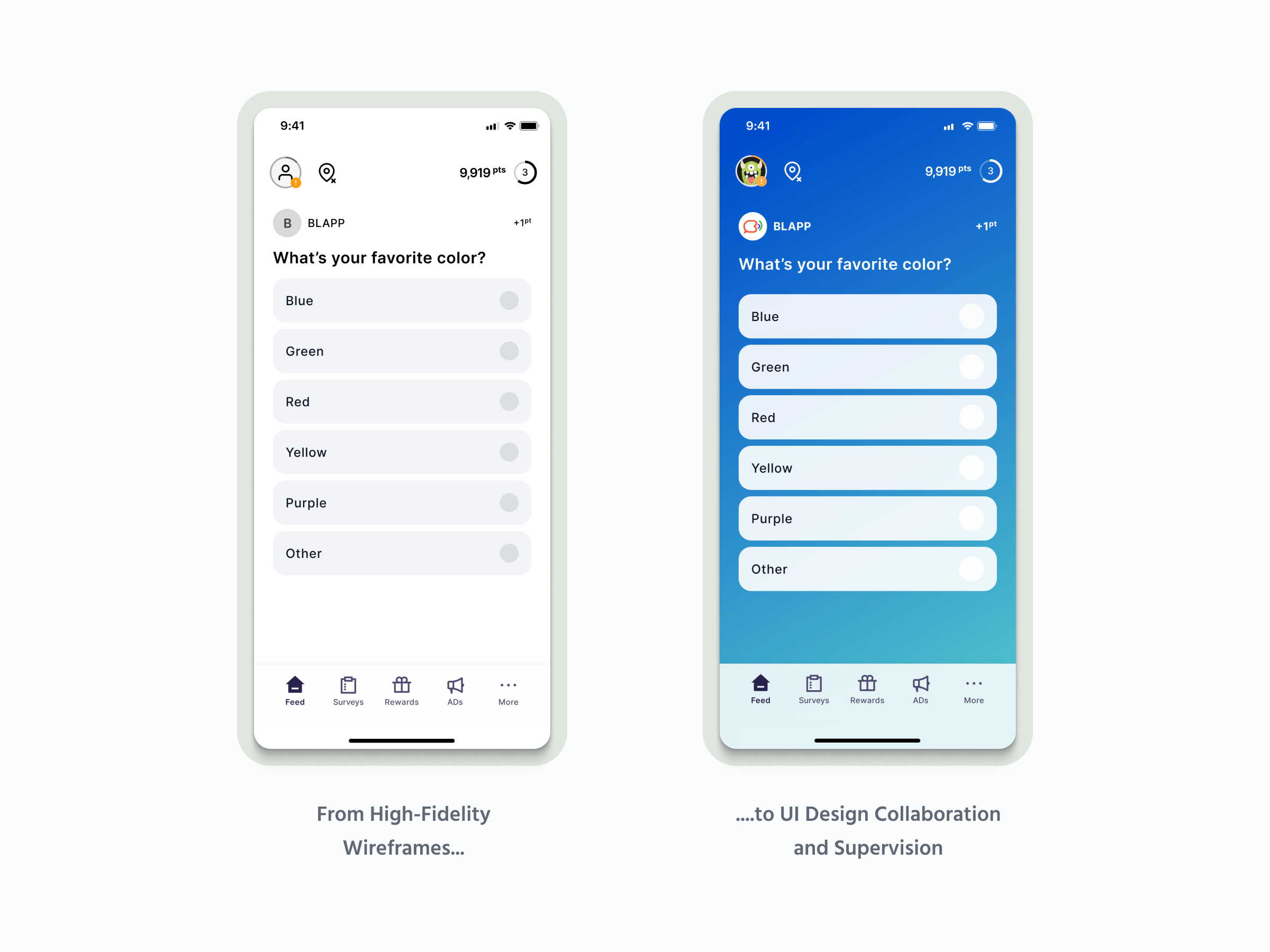
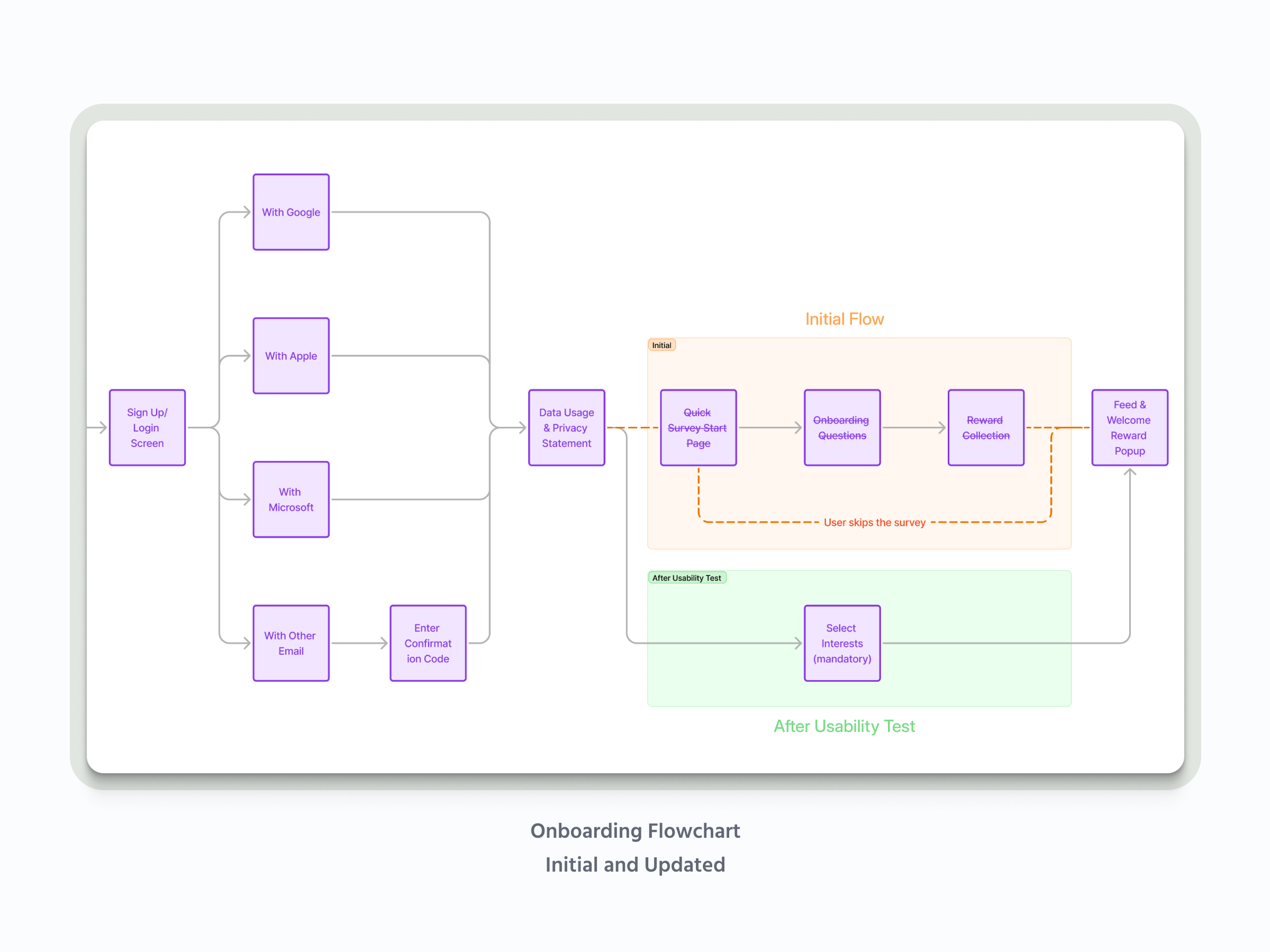
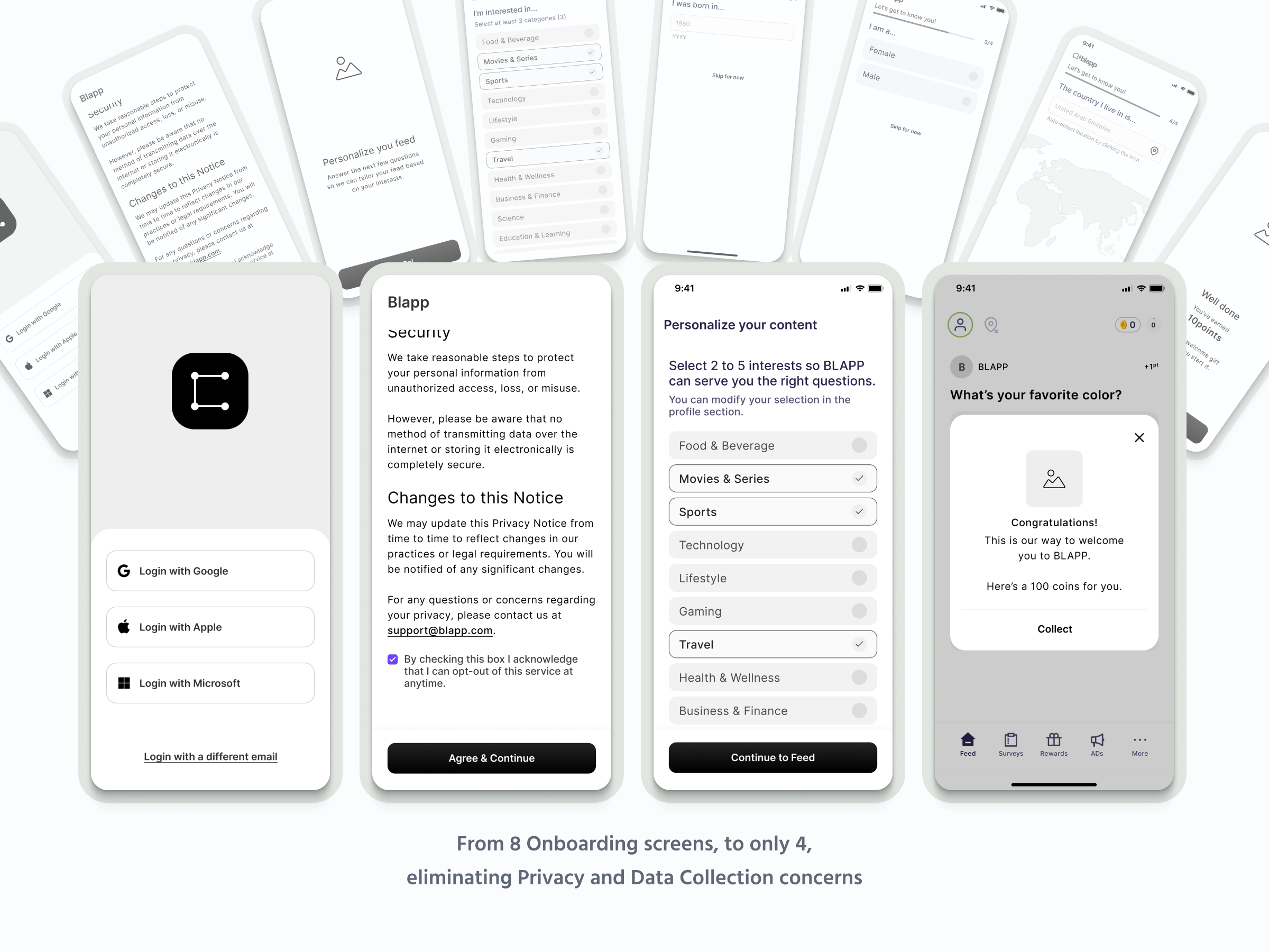
When we tested our first high-fidelity prototypes (built with a super-simple design system to keep everyone focused on functionality, not fancy visuals), almost everyone skipped the onboarding survey!
They wanted to get straight to the app, see what it was all about, before handing over any data. And even those few who did answer the survey? Some admitted they just clicked random answers to get the reward! Ouch.
That was a huge "aha!" moment. We had to throw out our assumptions and rethink the entire onboarding experience.
Design, iterate, test...
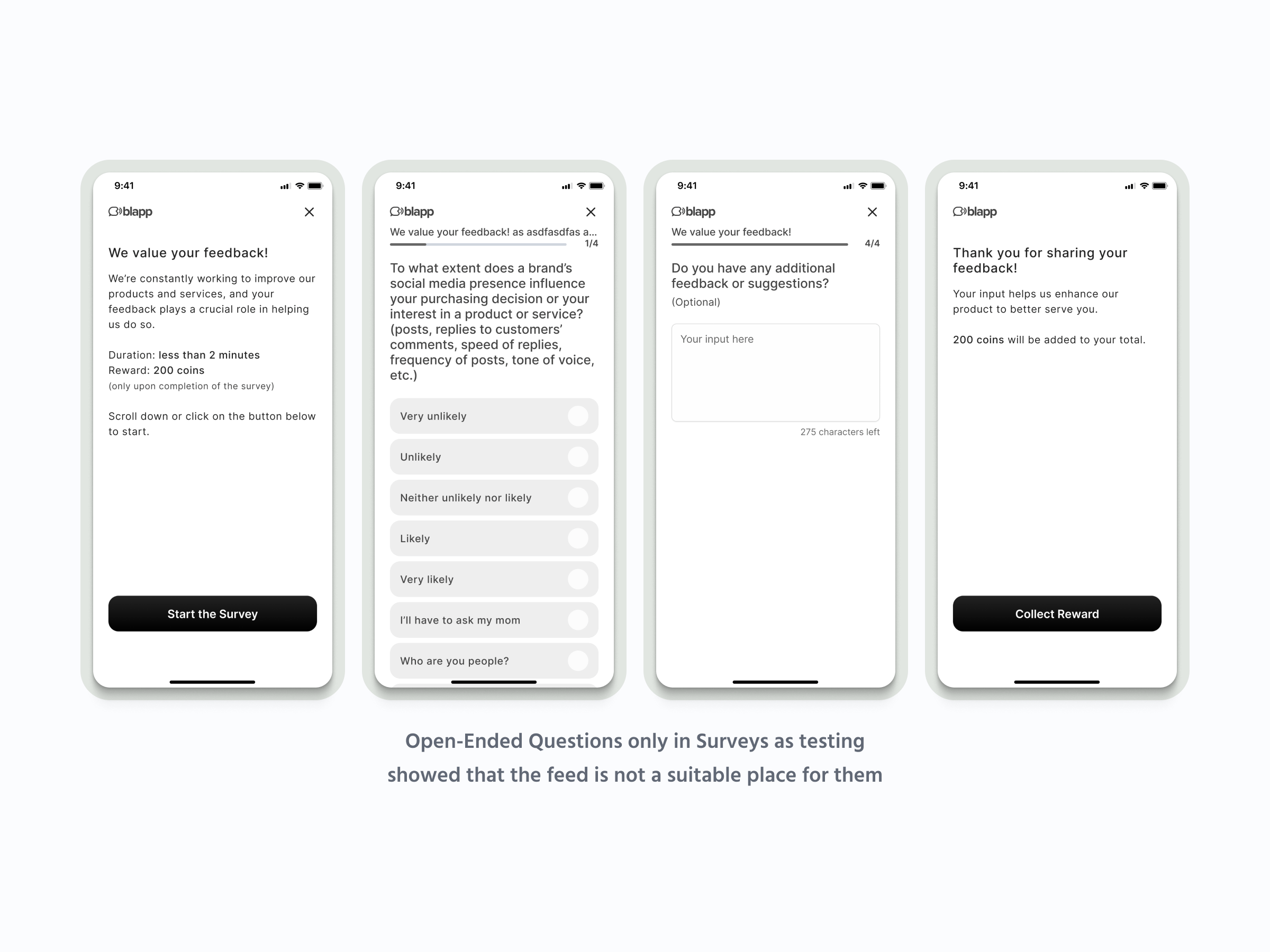
The feed itself was designed like a social media feed, but with a twist. We mixed in different types of questions – some multiple-choice, some ratings, some even with images. We kept it varied and engaging. And, yes, there were ads (we need to keep the lights on!), but we made them skippable, and users could even earn coins for watching them.
We also knew we needed a way to make sure the data we were getting was good data. So, we developed a "Credibility Score": a behind-the-scenes system that tracked how consistent people's answers were over time. This helped us identify users who were just clicking randomly (or, you know, bots trying to game the system).
We tested, iterated, and tested again. Each round of user feedback helped us refine the design, making it simpler, clearer, and more engaging. We added features like a progress bar for surveys, clear explanations of how coins and levels worked, and a super easy way to redeem rewards (with PayPal cash being the top choice!).
We also tackled the location tracking issue head-on. We knew people were wary, so we made it completely optional and emphasized that the data would be anonymous. We even designed cool, location-based "challenges" (think treasure hunts!) to make it worthwhile.
Ready for launch
A BLAPP MVP that's ready to launch. It's an app built on respect for users, a commitment to data privacy, and a focus on making market research actually enjoyable. We're excited to see how it performs in the real world, and we'll be tracking key metrics like user downloads, engagement, and survey completion rates to keep making it even better. This project really drove home the point: listen to your users, be willing to change your plans, and always, always put the user experience first.
Abjjad - Arabic Digital Reading Platform
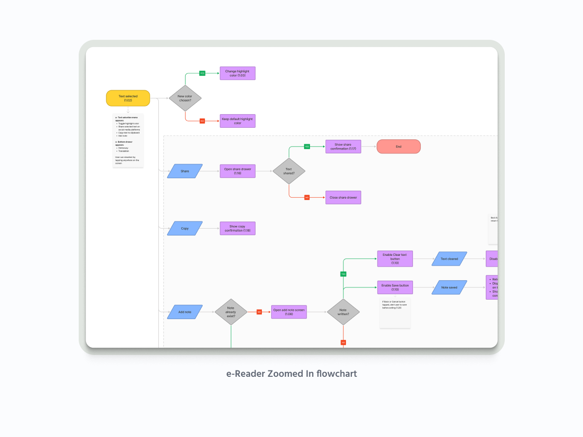
How We Redesigned Abjjad's Reader to Improve Readability & Feature Discovery
Addressing User Frustrations with the E-reader
We sent out a survey to Abjjad users (and got replies from 8% of them!), asking about other reading apps they use and what they liked/didn't like about Abjjad's. I also watched people actually using the app (12 users, some in person, some remotely), chatted with Abjjad fans online, and checked out the competition.
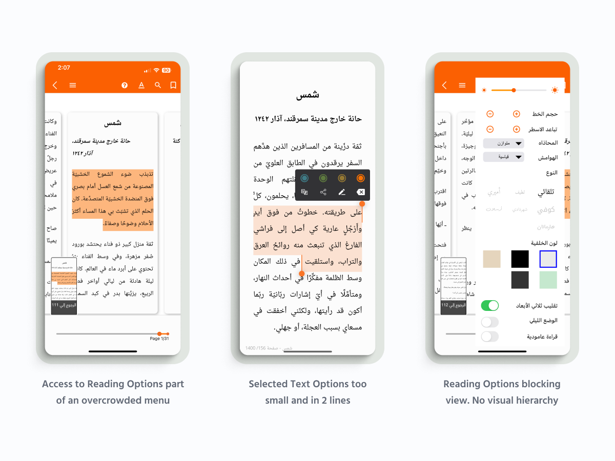
We quickly discovered a major problem: People couldn't find features that already existed! They were requesting things the app already did.
It wasn't just that, though.
• The font choices weren't great, making reading tiring.
• Changing the font size meant losing your place – annoying!
• Everyone had different expectations, based on other apps they'd used.
• It wasn't just the reader. Other issues were driving users away.
Designing Our Solution
1. Add better fonts
2. Fix the "losing your place" problem
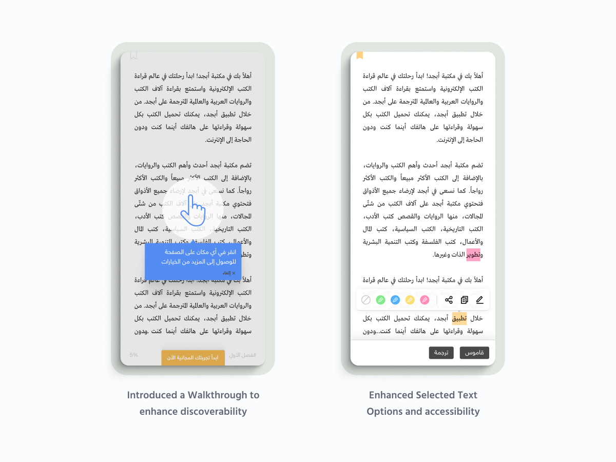
3. Improve feature discoverability
4. Create a simple bookmark system
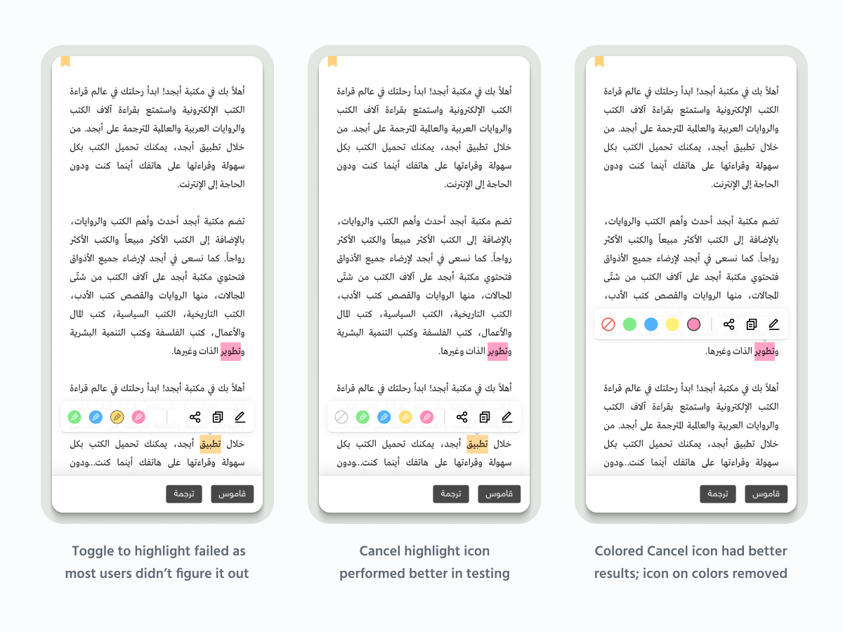
5. Make highlighting simpler (it was way too complicated)
I sketched some initial wireframes, then moved on to higher-fidelity designs, working closely with developers to make sure everything was feasible.
The key improvements in my designs included:
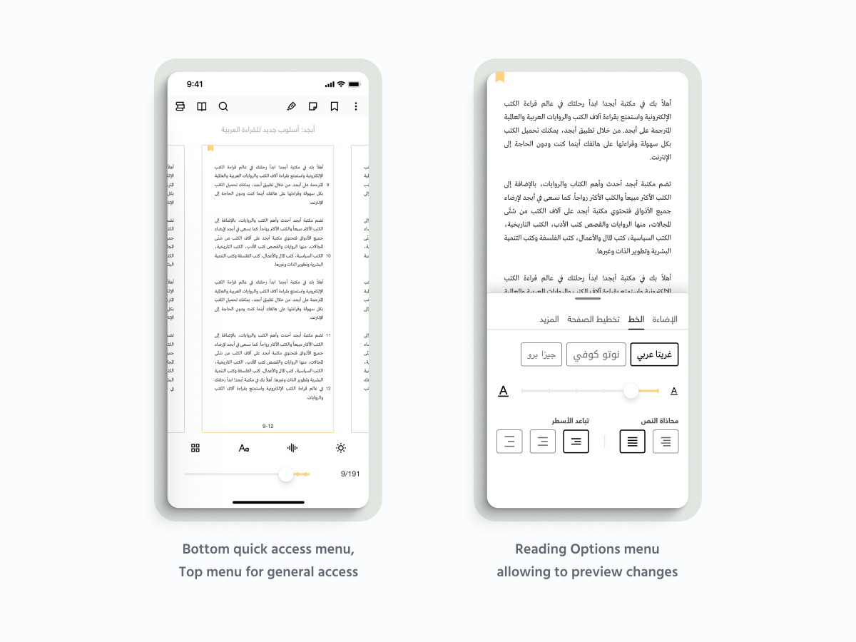
• A totally new control panel that slides in from the side (inspired by what users were familiar with from Kindle and Google Books)
• Clearer icons and labels for features
• New Arabic font options specifically chosen for digital reading
• A complete overhaul of the bookmarking system
• A simplified highlighting feature with color options
• Page-turn animations that could be turned off (for users who found them distracting).
Results
• Feature discovery improved by 47%
• Reading session duration increased by 23%
• Book completion rates went up 18%
• Positive reviews and ratings increased across app stores
But the most gratifying feedback came directly from users, who told us things like "Now I can finally enjoy reading!" and "I didn't even know I could highlight text before!"
This project taught me the importance of not just designing something beautiful, but truly understanding how users interact with a product and what their expectations are. Sometimes the most impactful improvements aren't adding new features – they're making existing ones discoverable and intuitive.
VERTO - Digital Banking System
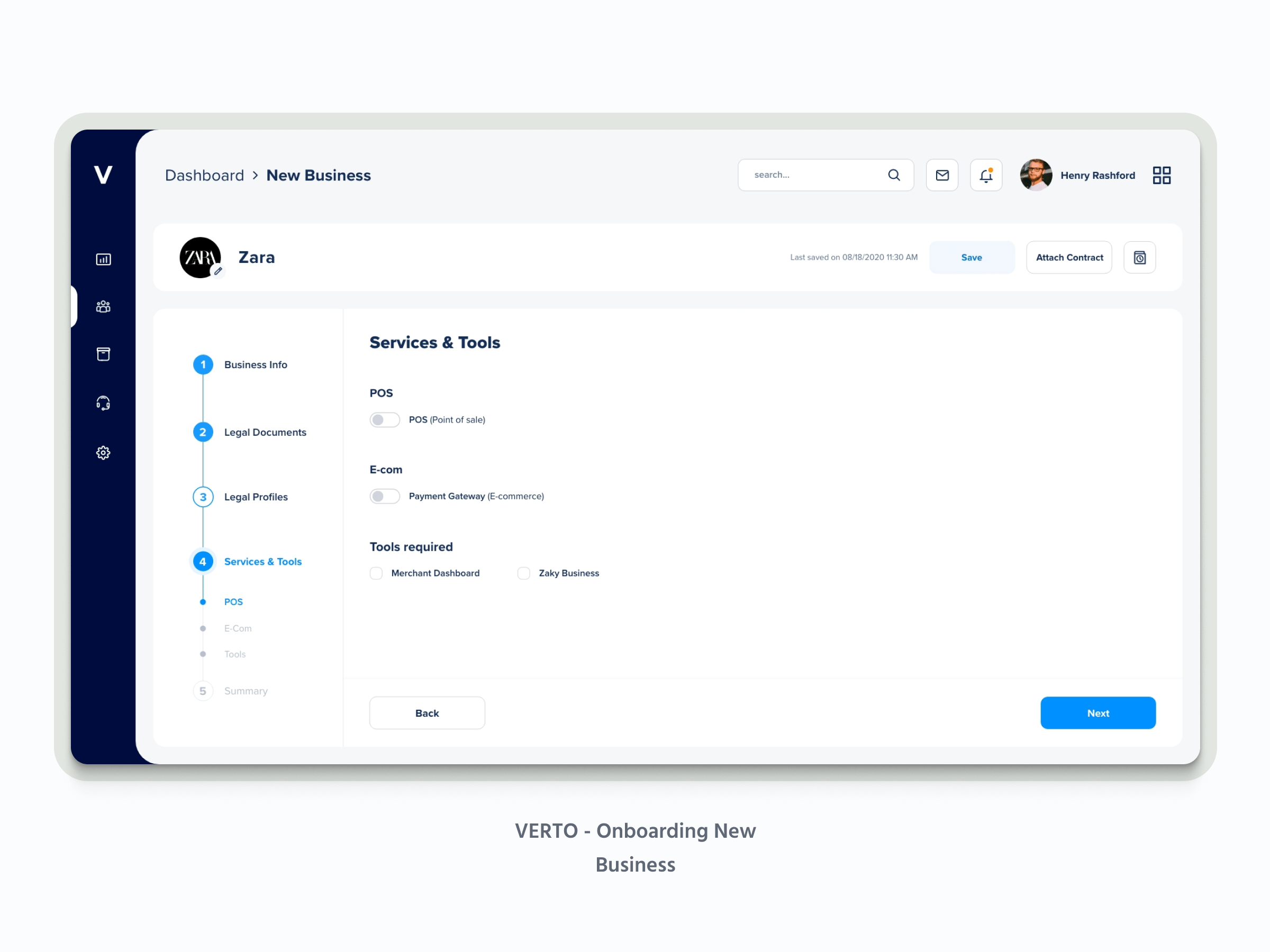
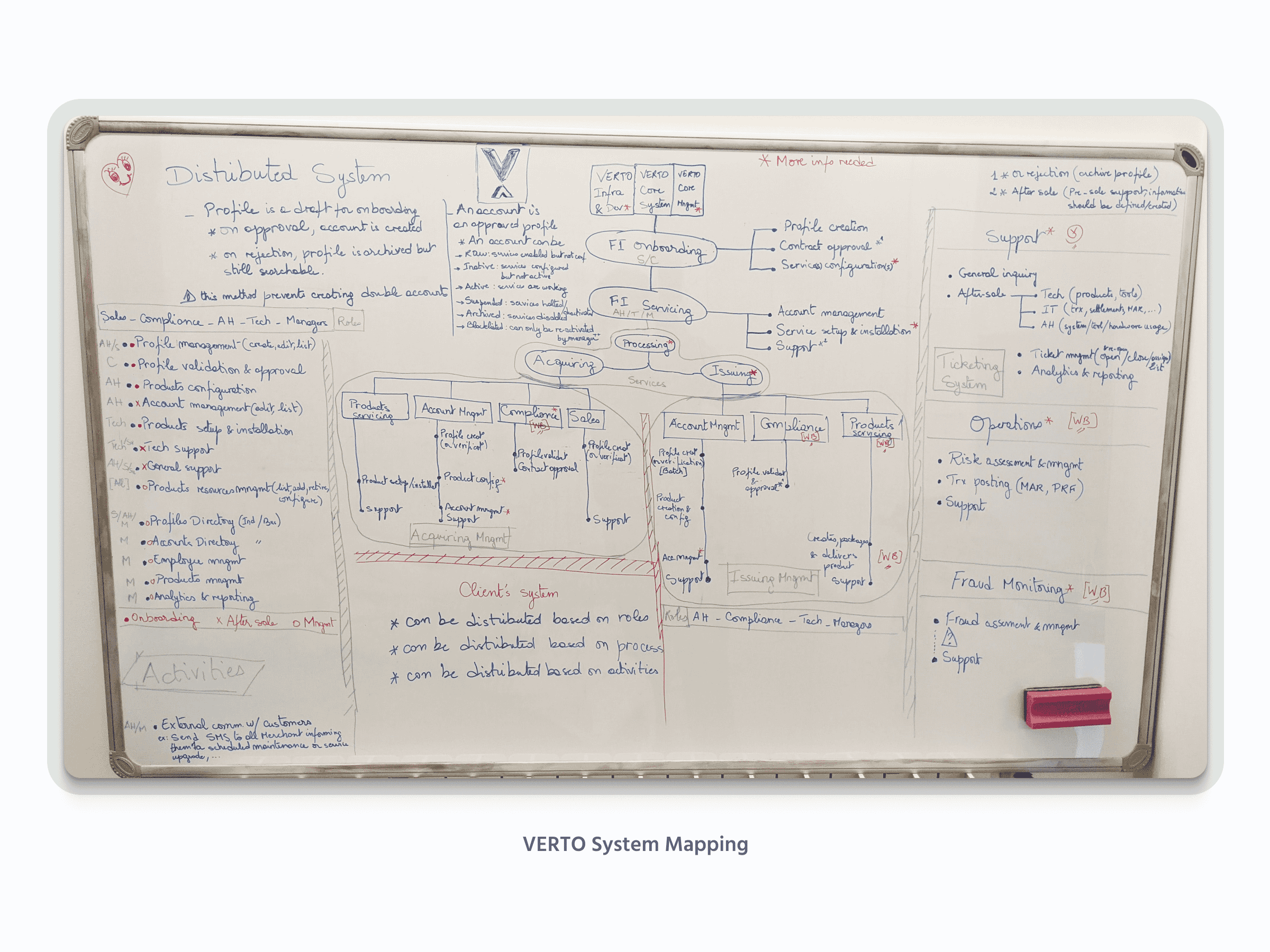
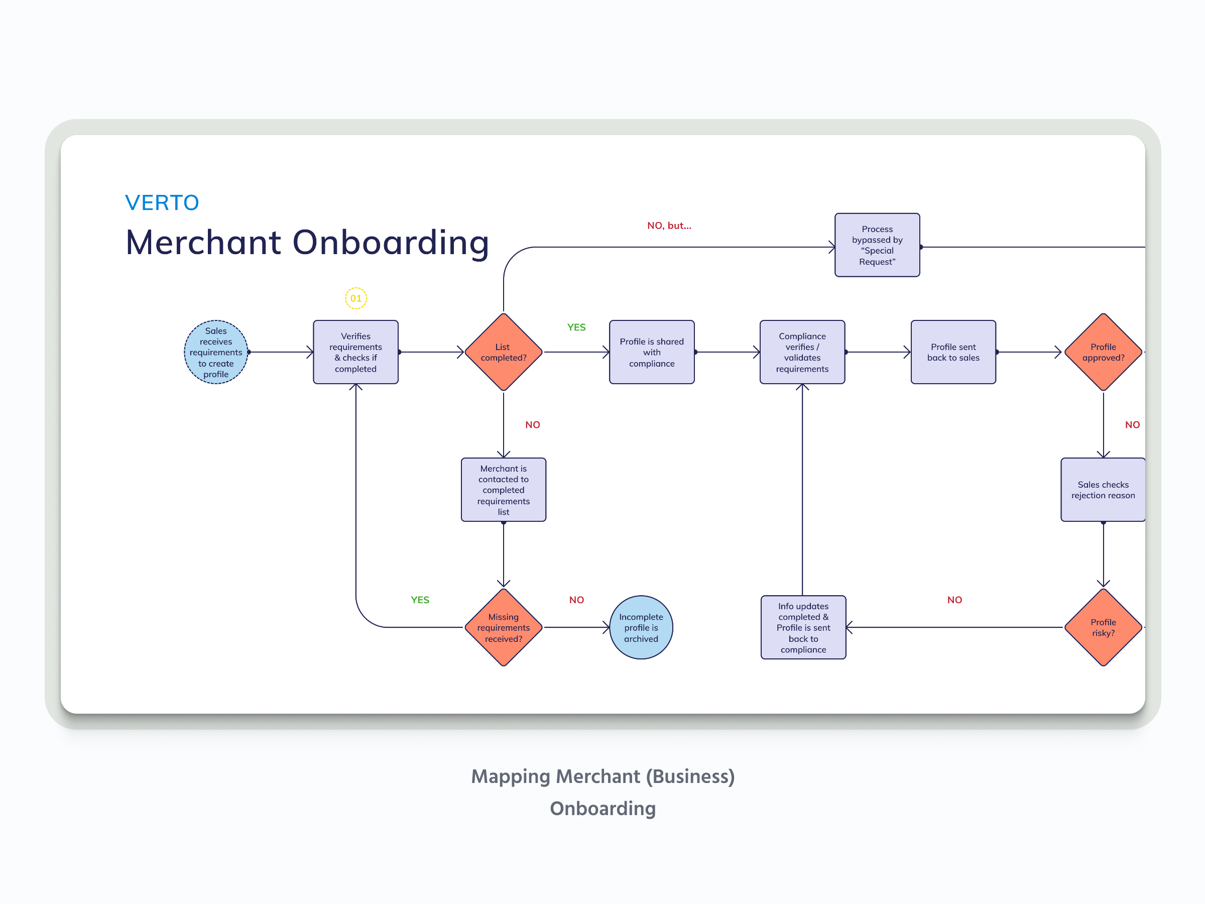
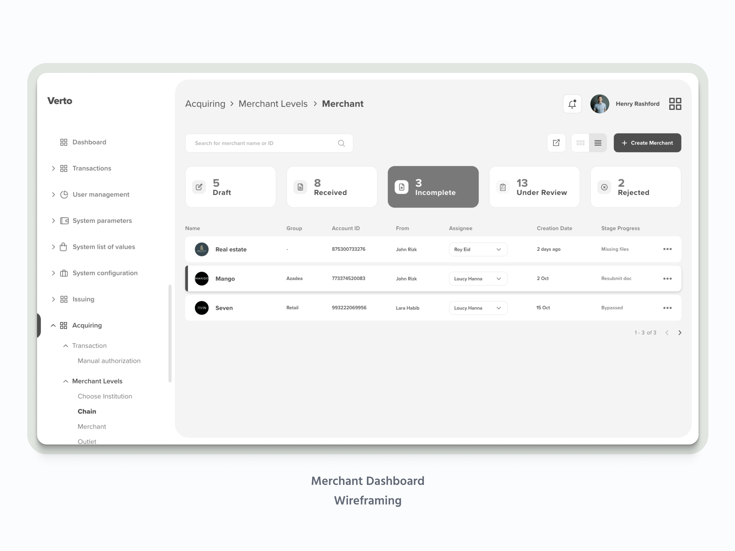
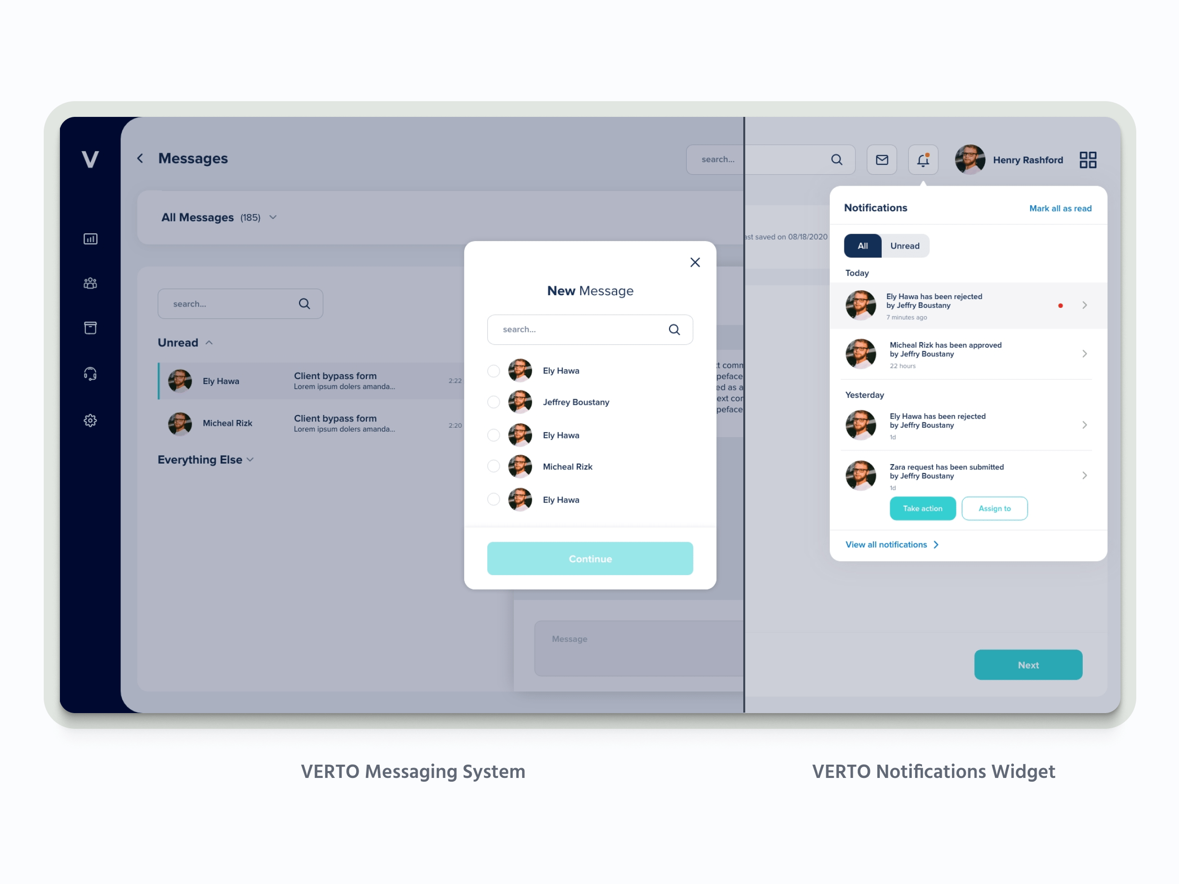
How We Overcame Challenges to Create the VERTO Banking System
The Challenge: More Than Just Tech
Getting Started: Aligning the Team
Next up: deep dives with each department. I learned how they worked, who did what, the tools they used (including the old, not so great VERTO), the problems they had, and what the testing banks had said.
With all that info, I ran a workshop to review what we'd found, assigned people to dig deeper, and adjust the plan. I did that a lot, really. We were always updating the plan.
Our first team meeting was all about making sure everyone understood the goals. We had people learn about departments other than their own – a great way to break down walls. We set deadlines, and then another workshop to review findings, fix the process maps, and define requirements.
Digging Deeper: Understanding the Processes
• How it works now (and why).
• Who's involved (and their roles).
• Tools & communication.
• How long it takes.
• The impact on customers.
Shaping the Solution: Planning and Priorities
We prioritized features to build a roadmap, and then brainstormed: user roles, a VERTO ID, the system's structure, and user profiles (following all the rules, of course!).
Building & Refining: Collaboration in Action
The design teams then:
• Watched users and improved the process maps.
• Found pain points (at areeba and the banks).
• Sketched out how to improve key tasks.
We had regular workshops to analyze what we found, come up with solutions, figure out how to onboard banks and customers, and keep improving the design system. I always updated the stakeholders after each workshop.
The Outcome: A Foundation for the Future
The new VERTO fixes the old version's problems. It's built on tons of user research, fits perfectly with areeba's other services, and follows all the regulations. It's set to be a leader, giving customers a secure and easy way to bank digitally.
What Others Say
“I have worked with Ronny on many occasions. He is my go-to-person for UX expertise and front-end related topics.
His expertise and his agility have been and continue to be indispensable to all the projects we collaborate on. Ronny is a skilled and patient communicator, I have experienced first-hand his ability to empathize with customers & users.”
Elie Abi Lahoud
Pioneering Applied Entrepreneurship at Accenture Europe - PhD, 2x Entrepreneur, Angel Investor