Abjjad MAY 2022
How We Redesigned Abjjad's Reader to Improve Readability & Feature Discovery
Abjjad UX Research UX Design Interaction Design Accessibility Dev Handover
Abjjad is like the Kindle of Arabic books. Users were running into problems with the e-reader, though, and the CEO asked me to help make it better.
Addressing User Frustrations with the E-reader
My role was to pinpoint the issues and redesign the reading experience. First, I needed to understand why people were frustrated.
We sent out a survey to Abjjad users (and got replies from 8% of them!), asking about other reading apps they use and what they liked/didn't like about Abjjad's. I also watched people actually using the app (12 users, some in person, some remotely), chatted with Abjjad fans online, and checked out the competition.
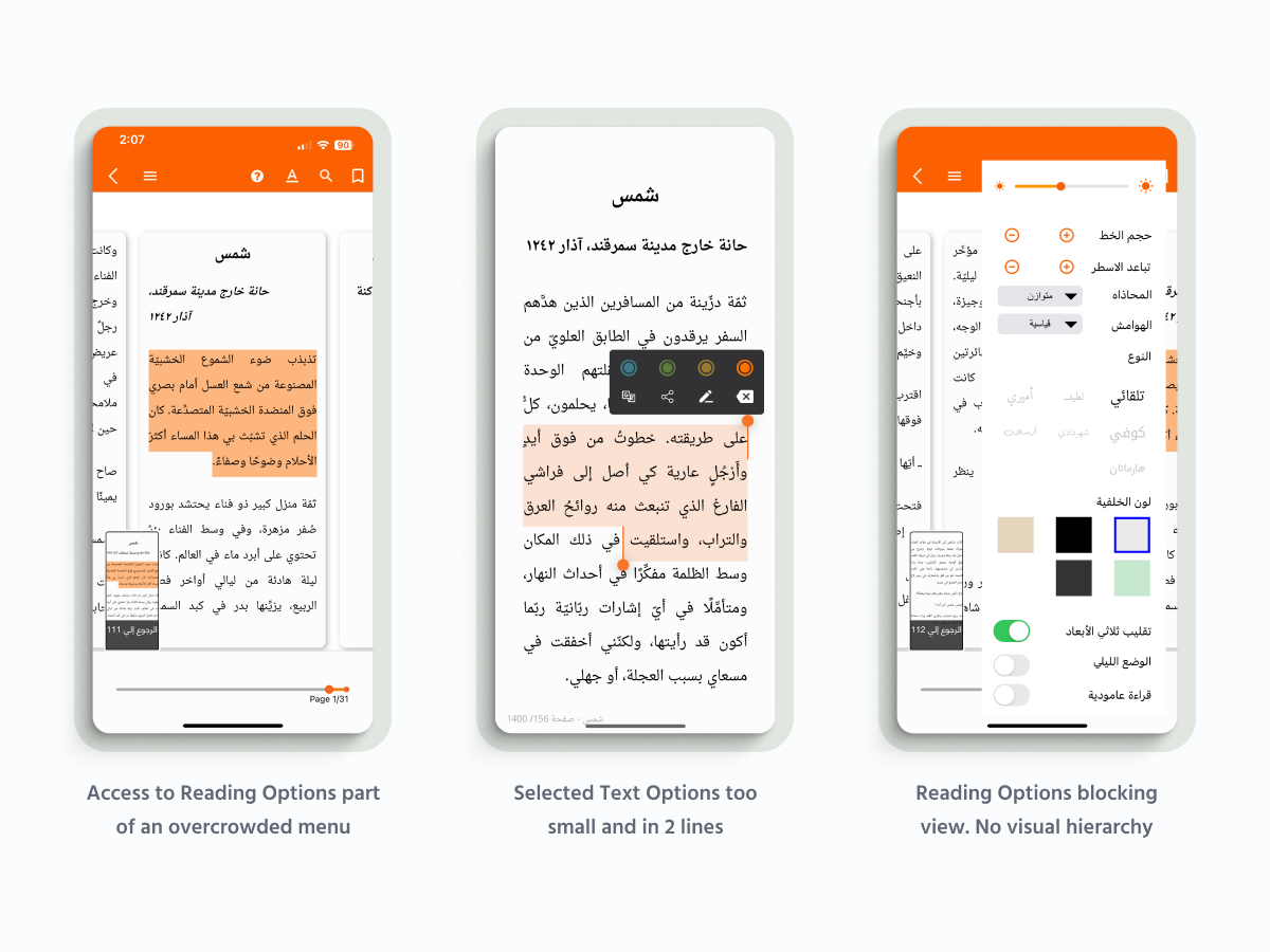
We quickly discovered a major problem: People couldn't find features that already existed! They were requesting things the app already did.
It wasn't just that, though.
• The font choices weren't great, making reading tiring.
• Changing the font size meant losing your place – annoying!
• Everyone had different expectations, based on other apps they'd used.
• It wasn't just the reader. Other issues were driving users away.
We sent out a survey to Abjjad users (and got replies from 8% of them!), asking about other reading apps they use and what they liked/didn't like about Abjjad's. I also watched people actually using the app (12 users, some in person, some remotely), chatted with Abjjad fans online, and checked out the competition.
We quickly discovered a major problem: People couldn't find features that already existed! They were requesting things the app already did.
It wasn't just that, though.
• The font choices weren't great, making reading tiring.
• Changing the font size meant losing your place – annoying!
• Everyone had different expectations, based on other apps they'd used.
• It wasn't just the reader. Other issues were driving users away.
Designing Our Solution
With all this knowledge, I created a roadmap for improving the app. The top priorities were:
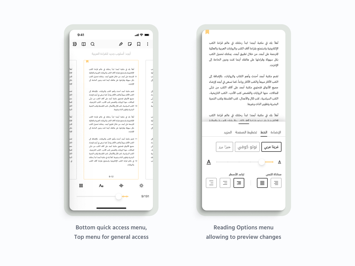
1. Add better fonts
2. Fix the "losing your place" problem
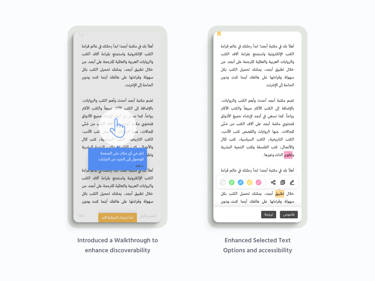
3. Improve feature discoverability
4. Create a simple bookmark system
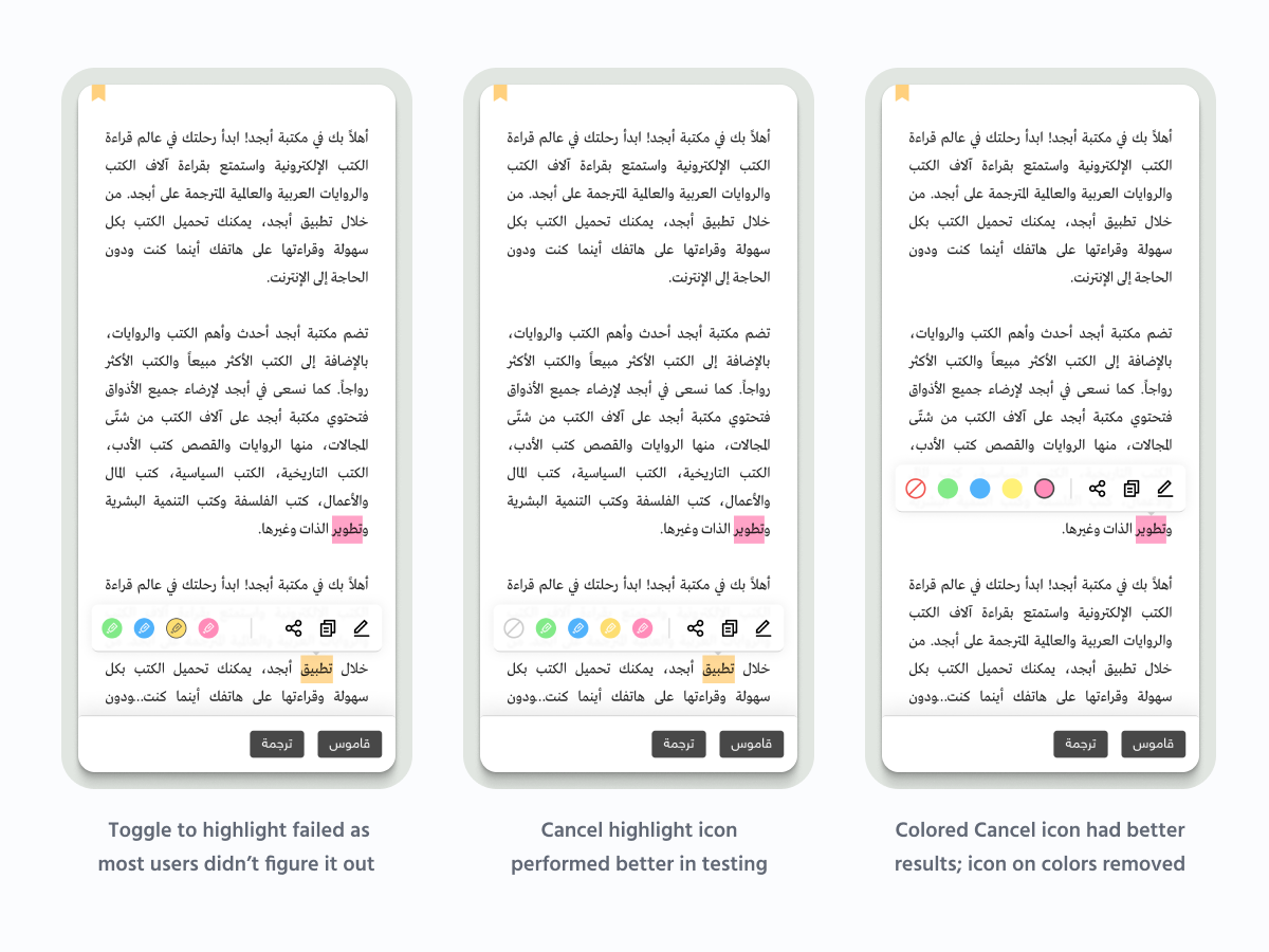
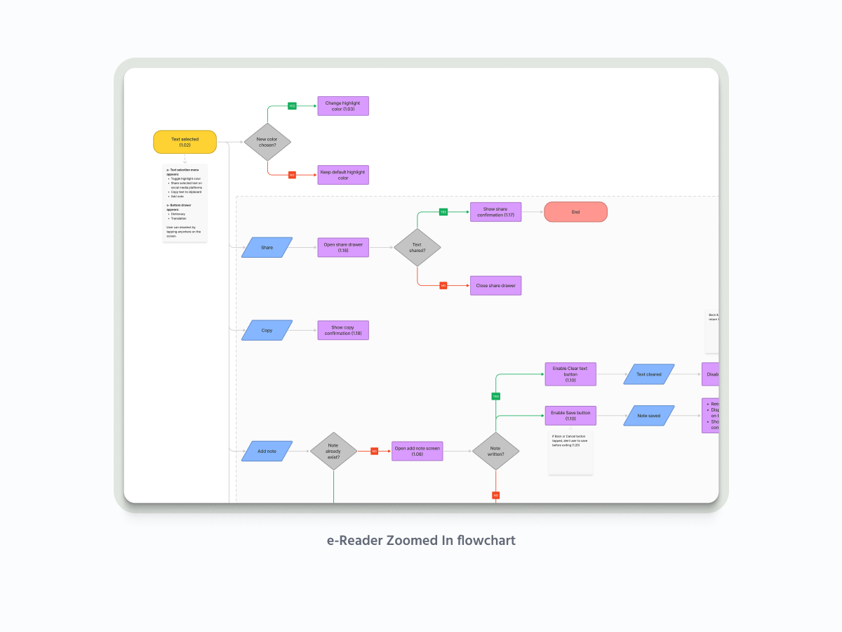
5. Make highlighting simpler (it was way too complicated)
I sketched some initial wireframes, then moved on to higher-fidelity designs, working closely with developers to make sure everything was feasible.
The key improvements in my designs included:
• A totally new control panel that slides in from the side (inspired by what users were familiar with from Kindle and Google Books)
• Clearer icons and labels for features
• New Arabic font options specifically chosen for digital reading
• A complete overhaul of the bookmarking system
• A simplified highlighting feature with color options
• Page-turn animations that could be turned off (for users who found them distracting).
1. Add better fonts
2. Fix the "losing your place" problem
3. Improve feature discoverability
4. Create a simple bookmark system
5. Make highlighting simpler (it was way too complicated)
I sketched some initial wireframes, then moved on to higher-fidelity designs, working closely with developers to make sure everything was feasible.
The key improvements in my designs included:
• A totally new control panel that slides in from the side (inspired by what users were familiar with from Kindle and Google Books)
• Clearer icons and labels for features
• New Arabic font options specifically chosen for digital reading
• A complete overhaul of the bookmarking system
• A simplified highlighting feature with color options
• Page-turn animations that could be turned off (for users who found them distracting).
Results
After we launched the redesigned reader, the results were impressive:
• Feature discovery improved by 47%
• Reading session duration increased by 23%
• Book completion rates went up 18%
• Positive reviews and ratings increased across app stores
But the most gratifying feedback came directly from users, who told us things like "Now I can finally enjoy reading!" and "I didn't even know I could highlight text before!"
This project taught me the importance of not just designing something beautiful, but truly understanding how users interact with a product and what their expectations are. Sometimes the most impactful improvements aren't adding new features – they're making existing ones discoverable and intuitive.
Abjjad - Arabic Digital Reading Platform