BLAPP OCT 2024
How We Designed BLAPP to Overcome Privacy Concerns & Boost Participation
MEmob User Interview Survey Design Usability Testing Data Analysis Interaction Design
The challenge was clear: people in the UAE, Saudi Arabia, and Qatar were tired of boring surveys and worried about their online privacy. Market research companies were struggling to get good data, and users felt like their opinions weren't valued (and their data wasn't safe).
We wanted to build BLAPP, a mobile app to change all that, to make sharing opinions fun, rewarding, and respectful of user privacy.
But how?
My role was to lead the UX design and figure that out.
We wanted to build BLAPP, a mobile app to change all that, to make sharing opinions fun, rewarding, and respectful of user privacy.
But how?
My role was to lead the UX design and figure that out.
Understanding the user
This wasn't about just designing a pretty app; it was about understanding why people were turned off by existing survey apps and creating something completely different.
We started by diving deep into research. We talked to potential users... lots of them. We ran online surveys, reaching over 300 people across our target countries. We also peeked under the hood of competing apps, seeing what worked (and what definitely didn't).
The message from users was loud and clear: "We hate giving out personal information upfront!" They were skeptical, suspicious, and frankly, bored with the typical survey experience. Rewards were a big draw, especially cash, but privacy was a major roadblock. We also learned they didn't know what Zero-Party Data was.
Creating the personas
This research led us to create four key "personas"; fictional users representing our main audience segments.
There was Omar, the reward-hungry student; Fatima, the privacy-conscious professional; Khaled, the casual user just looking for something easy; and Noura, who loved sharing her opinions. These personas became our guiding stars.
There was Omar, the reward-hungry student; Fatima, the privacy-conscious professional; Khaled, the casual user just looking for something easy; and Noura, who loved sharing her opinions. These personas became our guiding stars.
Challenging our assumptions
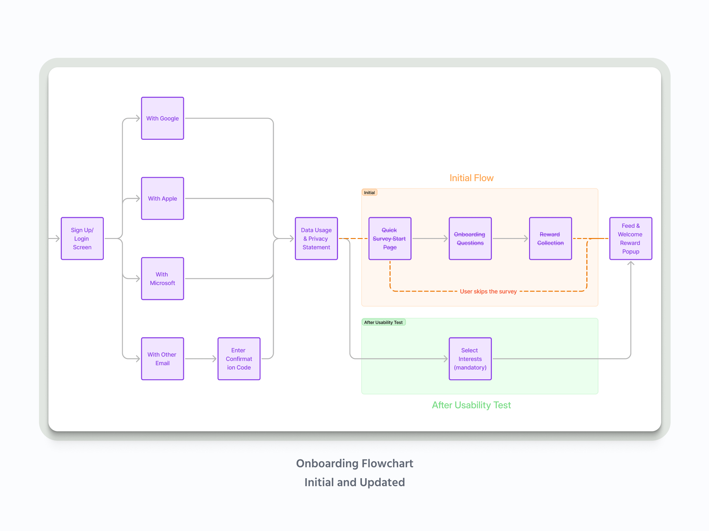
Our initial plan, based on some (incorrect!) assumptions, was to have a quick onboarding survey asking for basic info like age and location. We thought, "Hey, it's just a few questions, right?"
Wrong.
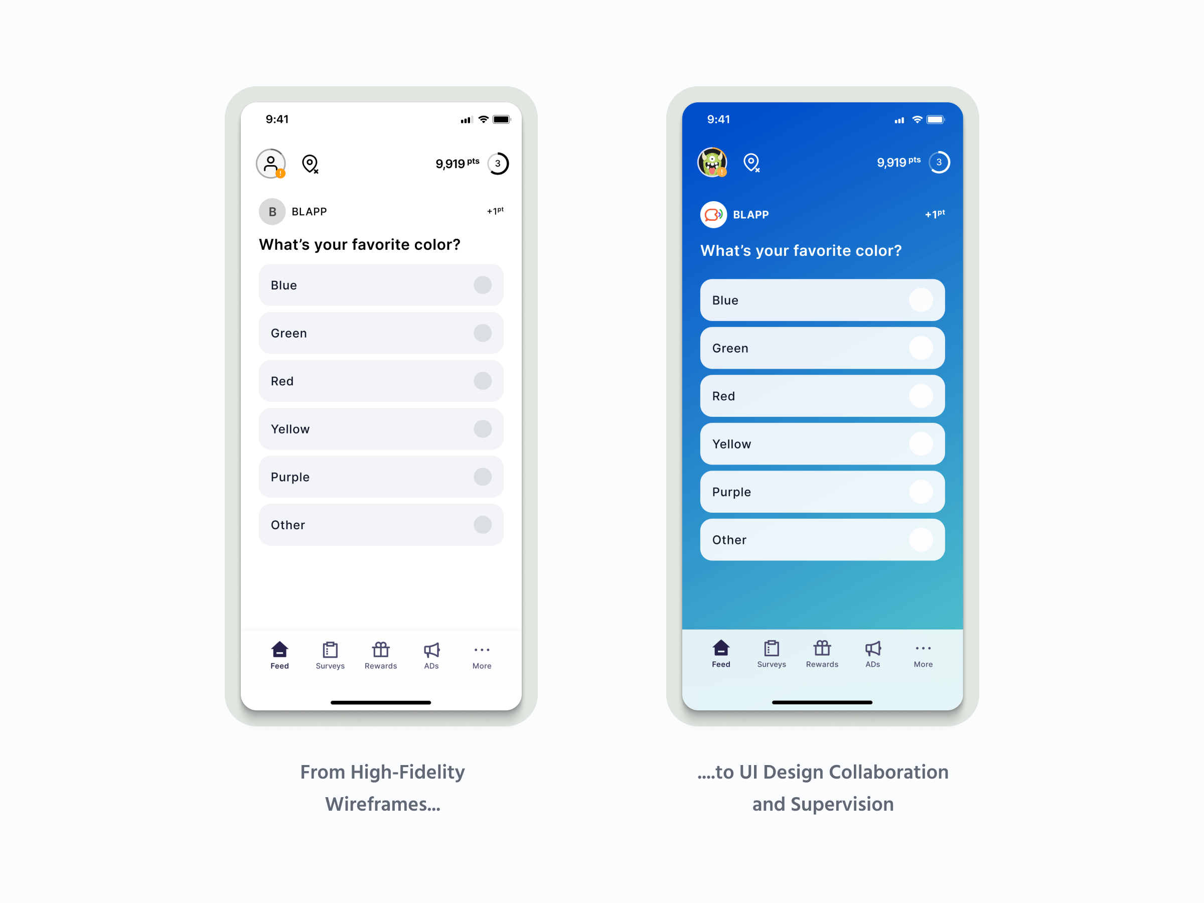
When we tested our first high-fidelity prototypes (built with a super-simple design system to keep everyone focused on functionality, not fancy visuals), almost everyone skipped the onboarding survey!
They wanted to get straight to the app, see what it was all about, before handing over any data. And even those few who did answer the survey? Some admitted they just clicked random answers to get the reward! Ouch.
That was a huge "aha!" moment. We had to throw out our assumptions and rethink the entire onboarding experience.
Wrong.
When we tested our first high-fidelity prototypes (built with a super-simple design system to keep everyone focused on functionality, not fancy visuals), almost everyone skipped the onboarding survey!
They wanted to get straight to the app, see what it was all about, before handing over any data. And even those few who did answer the survey? Some admitted they just clicked random answers to get the reward! Ouch.
That was a huge "aha!" moment. We had to throw out our assumptions and rethink the entire onboarding experience.
Design, iterate, test...
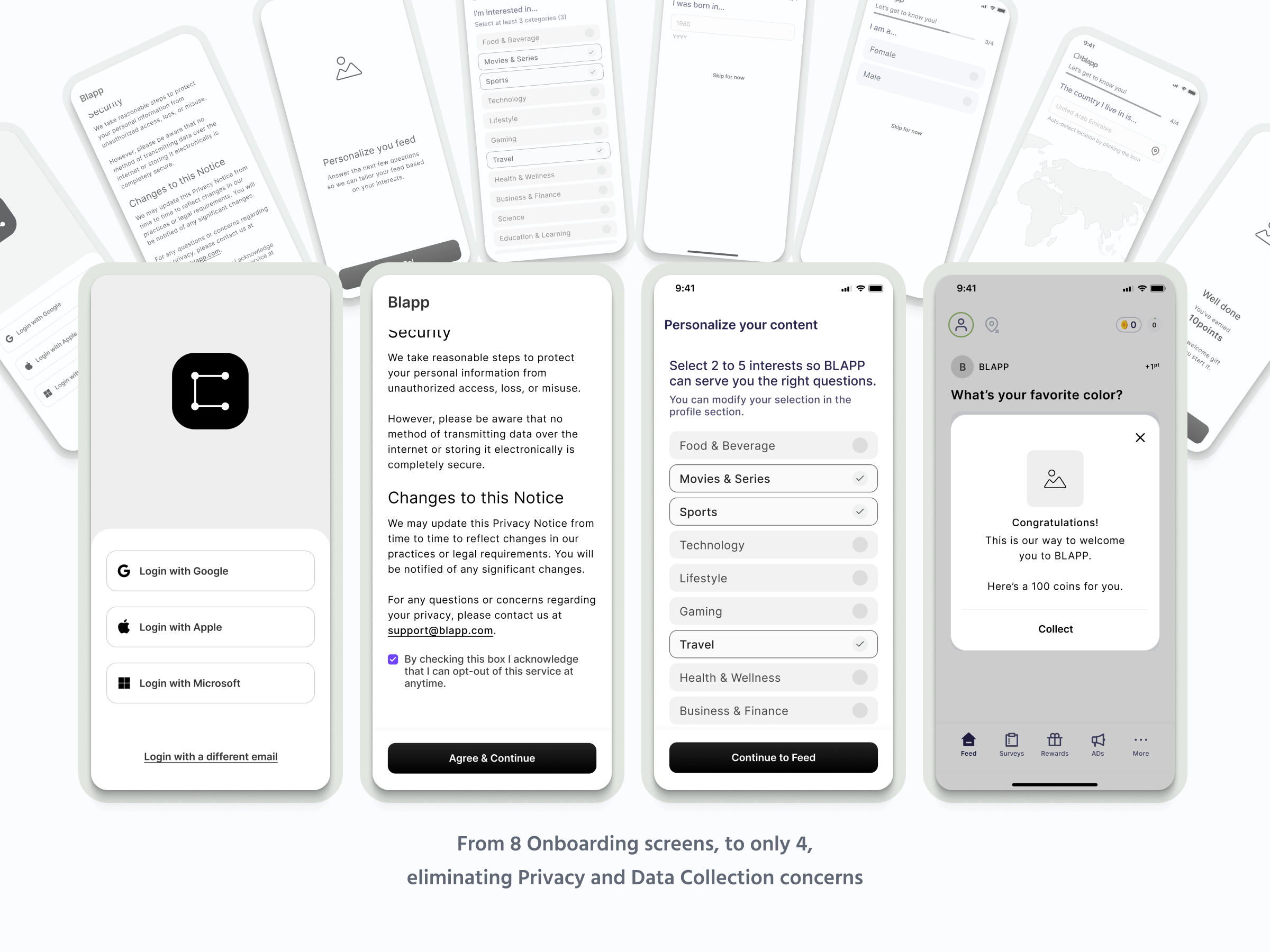
So, we flipped the script. We decided to make signup lightning fast: just an email, or one-click signup with Google, Apple, or Microsoft. No prying questions upfront. Instead, we made the very first thing users did was choose a few topics they were interested in – that was mandatory (but fun!). Then, boom, they were in the main feed, ready to answer questions and earn coins.
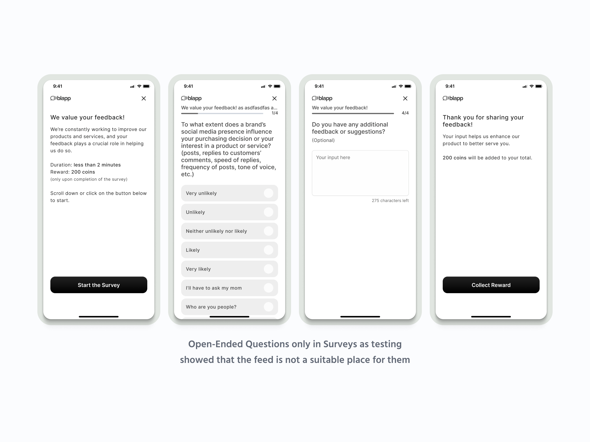
The feed itself was designed like a social media feed, but with a twist. We mixed in different types of questions – some multiple-choice, some ratings, some even with images. We kept it varied and engaging. And, yes, there were ads (we need to keep the lights on!), but we made them skippable, and users could even earn coins for watching them.
We also knew we needed a way to make sure the data we were getting was good data. So, we developed a "Credibility Score": a behind-the-scenes system that tracked how consistent people's answers were over time. This helped us identify users who were just clicking randomly (or, you know, bots trying to game the system).
We tested, iterated, and tested again. Each round of user feedback helped us refine the design, making it simpler, clearer, and more engaging. We added features like a progress bar for surveys, clear explanations of how coins and levels worked, and a super easy way to redeem rewards (with PayPal cash being the top choice!).
We also tackled the location tracking issue head-on. We knew people were wary, so we made it completely optional and emphasized that the data would be anonymous. We even designed cool, location-based "challenges" (think treasure hunts!) to make it worthwhile.
Ready for launch
The result?
A BLAPP MVP that's ready to launch. It's an app built on respect for users, a commitment to data privacy, and a focus on making market research actually enjoyable. We're excited to see how it performs in the real world, and we'll be tracking key metrics like user downloads, engagement, and survey completion rates to keep making it even better. This project really drove home the point: listen to your users, be willing to change your plans, and always, always put the user experience first.
A BLAPP MVP that's ready to launch. It's an app built on respect for users, a commitment to data privacy, and a focus on making market research actually enjoyable. We're excited to see how it performs in the real world, and we'll be tracking key metrics like user downloads, engagement, and survey completion rates to keep making it even better. This project really drove home the point: listen to your users, be willing to change your plans, and always, always put the user experience first.
BLAPP - Zero-Party Data Survey App